Qfit Fitness Centre
Connecting fitness brand energy with a clear visitor journey—from discovering the centre to exploring offerings and making an enquiry. In development.
From discovering a fitness brand to finding a confident next step.
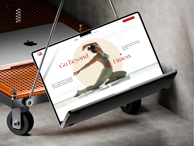
Fitness website UX/UI design
Visitor journey and information architecture
Visual hierarchy and consistent components
Responsive layouts and clear calls to action
Energy gets attention. Clarity supports the decision.
Qfit Fitness Centre is a website design project for prospective members discovering the brand and exploring what it offers. My role focused on connecting an engaging visual direction with an easy-to-navigate experience, giving visitors the information they need before deciding whether the centre suits their goals.
- Fitness website UX/UI design
- Visitor journey and information architecture
- Visual hierarchy and consistent components
- Responsive layouts and clear calls to action
Choosing a fitness centre takes more than a striking image.
Visitors need to understand the offering, evaluate whether it fits their interests, and find a clear next step. The design challenge was to communicate the brand's energy without letting visual elements compete with important information. I approached the website as a decision-making journey, not a collection of isolated sections.
Discover. Explore. Evaluate. Take action.
I used a simple visitor journey to guide the content structure: introduce the brand, help visitors explore relevant offerings, provide the details needed to evaluate them, and make the next step clear. Enquiry or membership-related calls to action belong where the visitor has enough context to decide; this describes the design intent, not confirmed live website functionality.
- Discover the brand and its purpose
- Explore the centre's offerings
- Evaluate relevant details
- Find a clear enquiry or membership next step
Build the hierarchy before adding the visual energy.
I considered requirements and content needs, organized the information architecture, and planned layouts through wireframing before refining the interface. Typography, imagery, spacing, and consistent components balanced personality with readability. Responsive design considerations covered navigation, content order, and interactive elements across screen sizes; review and refinement focused on clarity and cohesion.
- Scannable headings and deliberate spacing
- Meaningful content groupings
- Distinct actions placed at relevant moments
- Consistent, adaptable interface patterns
Connect the visitor's goals with the business's goals.
The project reinforced the value of designing around the whole journey. Brand presentation creates interest, but content clarity and straightforward navigation help visitors evaluate the offering. The design aims to support relevant enquiries and membership interest; no measured conversion improvements or user-testing results are claimed.
A design story in progress.
The Qfit website remains under development. The supplied cover previews the design rather than a live experience. The full presentation and approved project screens will be shared when available; no external project link is available yet.

Redesigning employee transportation workflows through role-specific dashboards, clearer navigation, and consistent web and mobile experiences.
Let’s make something
meaningful.
Let’s talk Good products start with good conversations.