PetroWorld Website
Organizing a multi-industry business into a clearer corporate website, with structured offerings and straightforward enquiry pathways. A working test build is live for review.
A broad business offering, organized into a clearer digital experience.
Open the test site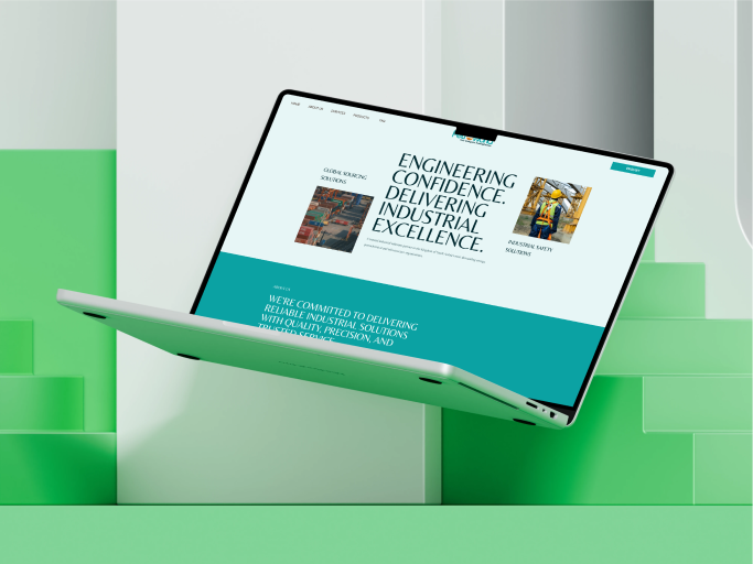
Corporate website redesign
Content organization and information architecture
Visual hierarchy and interface consistency
Clear pathways to business enquiries
Help visitors understand the business first.
Established in Saudi Arabia in 2005, PetroWorld serves industries ranging from oil and gas and construction to medical and laboratory supplies, clothing, and office equipment. At Teknika Solutions, I worked on its corporate website redesign, focusing on content structure, page layouts, and a professional interface that helps potential customers understand this breadth of offerings.
- Corporate website redesign
- Content organization and information architecture
- Visual hierarchy and interface consistency
- Clear pathways to business enquiries
Breadth should not become information overload.
With several industries to communicate, the challenge was to make the company's offering understandable without overwhelming visitors. A customer needs to recognize the relevant service, find supporting information, and know where to go next. I focused on the relationship between content hierarchy, navigation, and contact pathways rather than treating the redesign as a purely visual exercise.
Start with what a visitor needs to know.
I considered the business purpose and the information visitors need to evaluate its offerings. That understanding guided the information architecture: related content grouped into logical sections, clearer navigation, and page layouts planned around a straightforward browsing experience.
Make a diverse offering easier to scan.
I used deliberate headings, spacing, imagery, and alignment to distinguish essential information from supporting detail. Consistent layouts and interface elements helped the pages feel connected, while structured service presentation made the business easier to explore. Contact pathways were kept clear for visitors ready to make an enquiry. Review and refinement focused on readability, usability, and visual consistency.
- Logical groupings for services and products
- Consistent typography and page layouts
- Straightforward navigation between sections
- Business-focused contact pathways
Clarity is part of business communication.
This project reinforced that a corporate website must do more than look professional: it must make a company's capabilities understandable. My contribution connected content organization with UX/UI design, strengthening my approach to business-focused websites. No measured conversion or usability improvements are claimed.
Design work documented. Test build now open.
This story describes my website redesign contribution. The supplied cover is a design preview; the redesigned experience now runs as a public test build that can be opened and reviewed, with approved screens and the full presentation to follow.
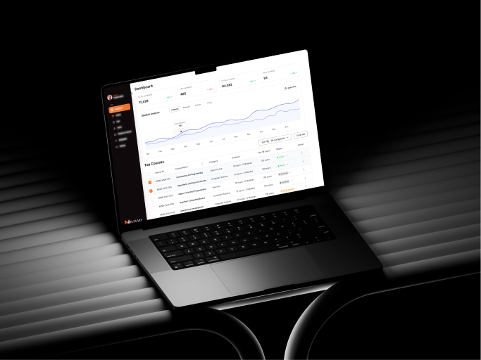
A centralized admin interface for managing large-scale education workflows, students, and reporting with a premium, responsive UI Kit design.
Let’s make something
meaningful.
Let’s talk Good products start with good conversations.